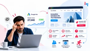
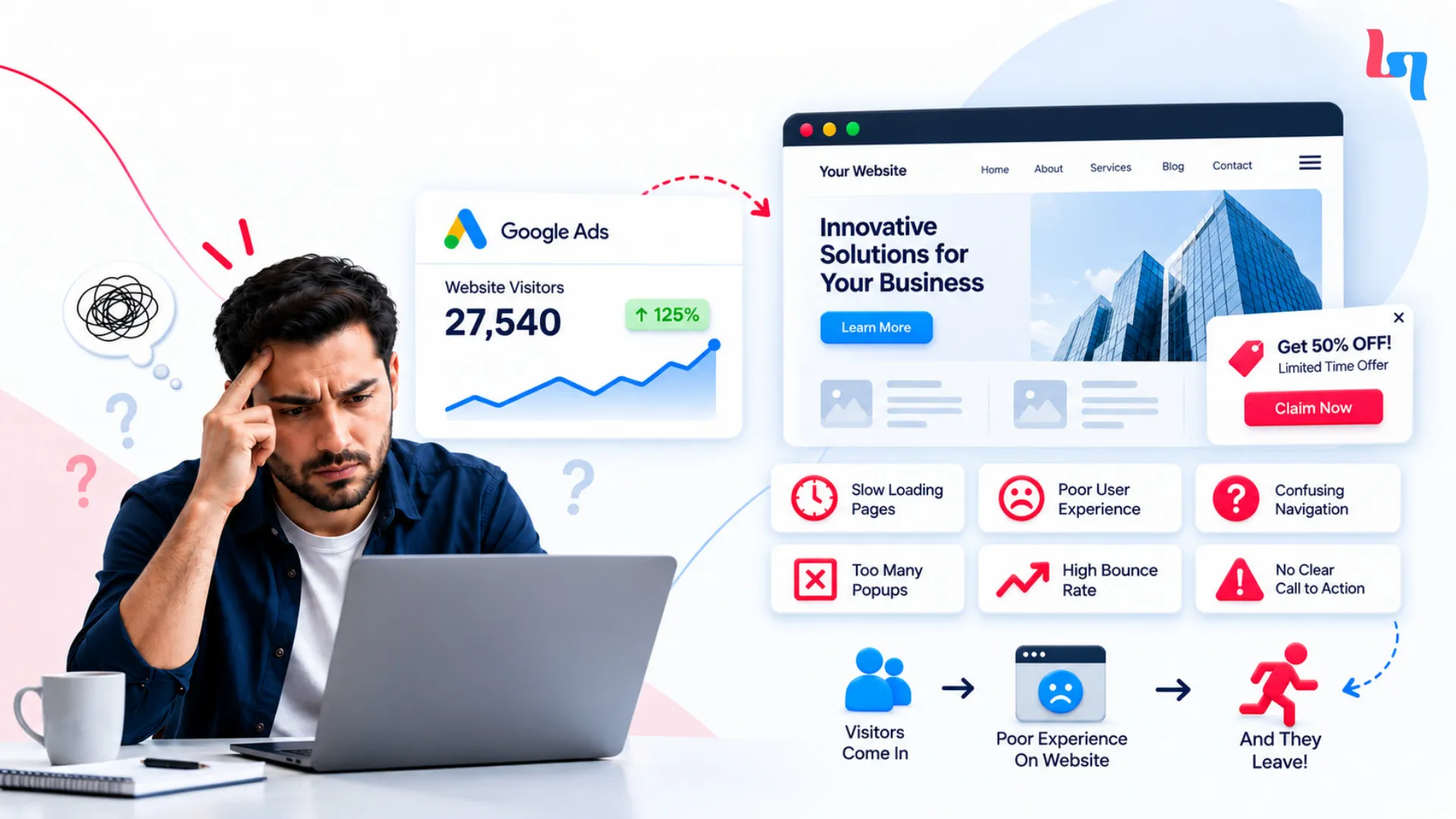
You spent ₹60,000 on Google Ads last month. The campaign brought 3,000 clicks to your website, but only 18 people enquired.
Your marketing team wants to change the audience. The developer says the website works fine. Someone suggests increasing the budget.
But you’re still paying for visitors who leave without contacting you.
I see this as a problem worth investigating before spending another rupee on advertising.
The campaign may be attracting the wrong people. The website may not be giving them what they expected Or simply trying to ask a question.
You need to follow the visitor further down the funnel to see what needs to be fixed.
First let’s look at why they are clicking in the first place.
Why Are Your Ads Getting Clicks but No Conversions?
Some people are ready to buy. Others are only looking around.
Imagine three people searching Google for accounting software.
One needs it urgently because their current system isn’t working. Another is comparing prices for next year. The third is a student researching software features.
All three might click the same advertisement.
Only one has an immediate buying requirement.
This matters because advertising platforms can report clicks without telling you which visitors are likely to become customers.
Take a hypothetical cybersecurity consulting company spending ₹1,20,000 on Google Ads.
It receives 1,500 clicks and 30 enquiries. That works out to ₹4,000 per enquiry.
The marketing team might consider that a reasonable result until sales reviews the enquiries.
Only six companies meet the requirements for a qualified lead.
The cost per qualified lead is now ₹20,000.
It could be your campaign is reaching out to businesses that aren’t part of your target audience, or your landing page is being viewed by people just wanting to find general information.
You will need to look at what search terms you’re targeting and what people are bouncing off. Simply changing the website won’t help if the wrong people are clicking through.
That’s why a paid advertising strategy needs to account for who becomes a customer, not just who visits the website.
Where Are Your Website Visitors Disappearing?
Your advertising report tells you who clicked. Your website data can show where the journey stopped.
Let’s return to the business that spent ₹60,000 and received only 18 enquiries.
Imagine opening its analytics and finding the following numbers.
| Customer Journey | Number | Stage Progression |
|---|---|---|
| Advertisement clicks | 3,000 | Starting point |
| Recorded landing-page sessions | 2,400 | 80% of clicks |
| Product or service page views | 900 | 37.5% of sessions |
| Enquiry form starts | 120 | 13.3% of page views |
| Completed enquiries | 18 | 15% of form starts |
These are hypothetical numbers, but they reveal something useful.
Of the 120 people who started the enquiry form, 102 didn’t complete it.
Now we have a specific part of the journey to investigate.
Why are ad clicks higher than website visits?
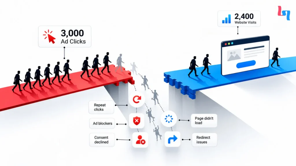
The first difference is between 3,000 clicks and 2,400 recorded sessions.
That doesn’t necessarily mean 600 people abandoned the website.
Double clicks, refusing to accept cookies, blocking scripts or abandoning the page. Google Ads and analytics will have different tracking methodologies.
First thing to check is the actual URL and any redirects. Also check how the tracking is set up and if the page itself is loading correctly.
If it’s not loading correctly on some phones then it’s an issue with your technical set up but if it is due to tracking then you will need to fix it another way.
Why do visitors leave without exploring?
People visit your site, but don’t engage with the product/service
You click through an advert for industrial equipment and are taken to a page about your history rather than a description of the products specs.
You came looking for a particular product. Now you’re being asked to search for it.
Some visitors will. Others will move to another supplier.
I would compare the advertisement with the destination page and check whether visitors can immediately find what brought them there.
Why do people abandon enquiry forms?
The final stage is particularly interesting.
A person has opened the form and started entering information. Something happens before submission.
It might be an issue with a required field, or too much information being asked for. Or maybe the submit button isn’t working on mobile.
You won’t really know unless you try.
If it is possible to track forms and record sessions you can see where the issue is. Just because a form is being abandoned doesn’t mean it is broken, it just means you need to look into it.
Your Advertisement Makes a Promise. Does Your Landing Page Keep It?

The visitor clicked for a specific reason. Your website should answer that need immediately.
Suppose you’re in charge of compliance within a tech company.
You search for ISO 27001 certification consultants.
You land on the below advert offering support to achieve certification and a chat with one of their experts.
You click on the link.
The site loads and has a large banner saying “Transforming businesses through technology”.
From here there are several options to choose from: Cloud Infrastructure, Software Development, Staffing and IT Consulting.
You scroll down to find the ISO 27001 option. Eventually, you find a short reference to compliance.
By then, you’ve spent more time searching than learning about the service.
Google considers landing-page relevance, usefulness, and navigability when evaluating landing-page experience as part of Quality Score.
Why the homepage may be costing you enquiries
While a homepage will give a broader overview of your business, visitors clicking on a service-specific ad are likely to have a more specific query.
When advertising Shopify development services you’ll want to show off what Shopify services you provide, any relevant projects you’ve undertaken, how much work you’ll do and how they can get in touch.
This can be done with a homepage but many times having a specific landing page for that particular campaign will give you more control over what you’re saying.
Show the offer before asking visitors to scroll
Suppose your advertisement says:
“Get a Free Website Conversion Audit.”
The landing page opens with:
“Welcome to Our Digital Marketing Agency.”
There’s nothing about the audit on the first screen.
I’d replace that opening with something directly connected to the advertisement:
Find out why your website visitors are not inquiring.
What this audit will cover and how to claim it.
Your visitors should know exactly what you are offering them and exactly what they need to do next without having to search your site.
Your Website Looks Great on a Laptop. What Happens on a Phone?
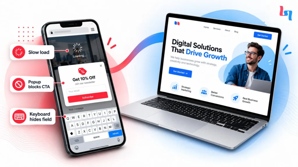
The website you approved on your office screen may behave very differently in someone’s hand.
Picture a business owner reviewing a newly designed website.
The photographs look sharp. The page feels modern. The contact button sits neatly beside the headline.
Everything looks ready.
Now open the same page on a phone using mobile data.
The banner appears quite slowly. The contact button is covered by a pop-up. The contact form is also hard to fill out because you can’t see the next input box due to the keyboard.
Looks great but functionality is lacking.
When testing I like to actually click through the page being advertised.
What faster loading can change
Vodafone ran a controlled experiment to understand whether page performance affected customer behaviour.
According to a Google web.dev case study, Vodafone improved Largest Contentful Paint by 31% on an optimized landing page.
The experiment reported:
8% more sales.
15% higher lead-to-visit rate.
11% higher cart-to-visit rate.
These were Vodafone’s results, not a promise that every business will see the same improvement.
Google recommends the following Core Web Vitals thresholds:
| Performance Metric | Recommended Threshold |
|---|---|
| Largest Contentful Paint | 2.5 seconds or less |
| Interaction to Next Paint | 200 milliseconds or less |
| Cumulative Layout Shift | 0.1 or less |
You can check your pages using Google PageSpeed Insights.
But I would also open the page on a real phone, tap every important button, complete the form, and check whether anything blocks the journey.
Good website design and development should make these actions straightforward, regardless of screen size.
Customers Like Your Product. What’s Stopping Them From Trusting You?
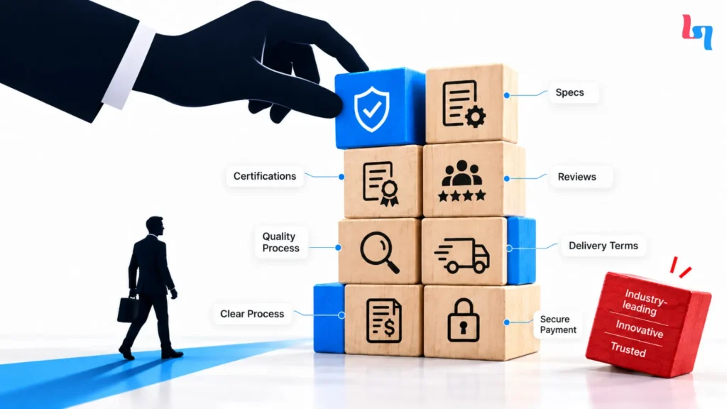
Sometimes people just leave because they are unable to find the information they need.
Let’s say you want to order some industrial equipment worth ₹15 lakh.
Website 1: Reliable service. High Quality Products.
Website 2: Technical Specifications, Manufacturing capabilities, Inspection processes, Delivery and Quotation.
Even though you haven’t contacted both suppliers yet, you can see that Website 2 has already provided you with more information.
This is important when you’re spending a large amount of money and taking a risk with your business.
What B2B buyers want to know
If you’re looking into getting cybersecurity consultancy, you may want to find out what sort of environments they can offer support for, how they will conduct their assessment(s) and what will be included in the deliverables.
Terms such as innovative, trusted and industry leading aren’t going to help much here.
Instead, a detailed service process, appropriate certifications, examples of work they have done with clients and example reports can be more helpful.
A buyer should be able to understand what the company can deliver before booking a sales call.
Why e-commerce customers hesitate
Let us take another example of a customer buying a ₹1,500 chocolate hamper.
The customer might really like the pictures but wonder if they will be delivered in time and what will happen if the packaging gets damaged.
If delivery terms and return policies are missing, placing the order becomes a risk.
According to Baymard Institute’s cart-abandonment research, 19% of surveyed US online shoppers who cited reasons beyond browsing reported abandoning an order because they didn’t trust the website with their credit-card information.
Customers need practical reassurance before paying.
Display genuine reviews, clear contact details, payment information, and delivery policies where visitors are making decisions.
Your Customer Wants to Enquire. Why Does the Form Ask So Much?
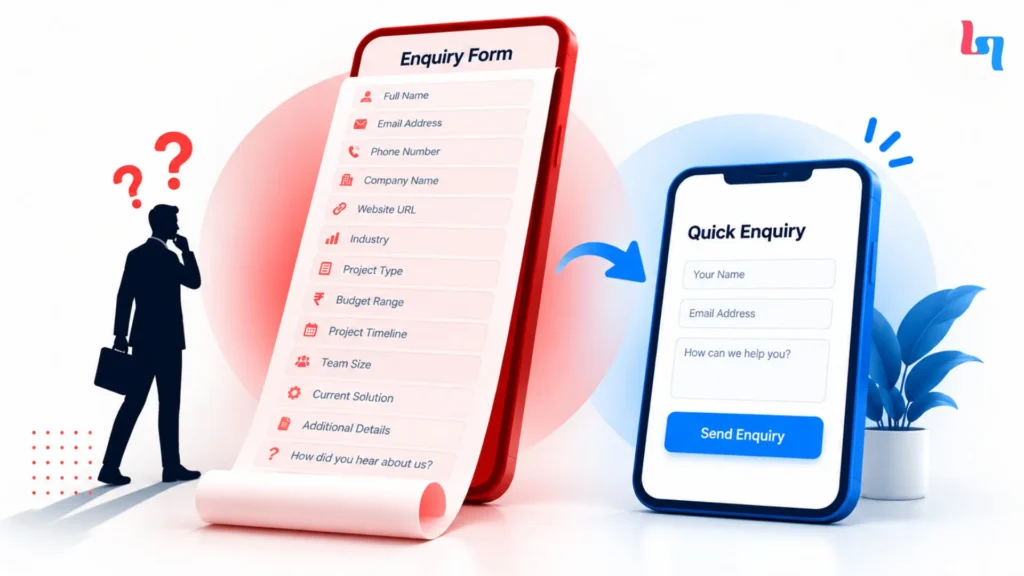
Someone came to ask a question. Your form shouldn’t feel like a job application.
Imagine an HR manager looking for Lean Six Sigma training for 25 employees.
She finds a suitable provider and clicks “Request Training Details.”
The form includes fields to request her title, company, industry, department, training budget, preferred dates, office and some other information.
She just wants to know what is on offer and get an idea of the cost.
Whilst there are some good questions that will help the sales team, you may not need all the information provided before talking to her for the first time.
Many initial requests will only require basic information such as the name, professional email address, organisation and a brief description of the requirement.
Some services may require more information. The important distinction is whether each field helps the business respond meaningfully.
Why checkout creates similar frustration
Imagine adding a ₹1,999 product to your cart.
At checkout, a delivery fee appears. The website requires account registration, and after registering, you’re asked to enter your address again.
The product hasn’t changed, but completing the purchase now requires more effort than expected.
Baymard Institute’s research reports an average documented cart abandonment rate of 70.22% across 50 studies.
Its 2026 research also reports these reasons among surveyed US shoppers who gave reasons beyond browsing:
| Reason for Checkout Abandonment | Percentage |
|---|---|
| Additional costs were too high | 40% |
| Delivery was too slow | 20% |
| Website didn’t feel trustworthy for payment | 19% |
| Account creation was required | 18% |
| Checkout was too complicated | 17% |
These percentages describe reported reasons among surveyed shoppers, not the share of all website visitors.
Show shipping charges early. Explain delivery timelines. Offer guest checkout where practical.
The enquiry is submitted. Does anyone respond?
Just because you have a completed form does not mean there will be a conversation with a sales person.
Let’s say your lead was worth ₹4,000 to generate, but the email is sent to an inbox that isn’t regularly checked.
The sales team check their messages 3 days later.
You will still see it as a conversion on your advertising dashboard.
I would look into whether the leads are going to the right person, if CRM’s are being created and customers are getting confirmation.
Sometimes the issue isn’t with the landing page design at all.
How Much Money Could Your Website Be Losing?
You may be able to improve sales without buying another click.
Let’s use a hypothetical online store.
It receives 5,000 paid visits each month, spends ₹1,00,000 on advertising, and sells products with an average order value of ₹2,000.
At a 1% purchase conversion rate, it generates 50 orders.
Now suppose the conversion rate improves to 1.8%, while traffic, advertising spend, and average order value remain unchanged.
| Business Metric | Before | After |
|---|---|---|
| Monthly paid visits | 5,000 | 5,000 |
| Advertising spend | ₹1,00,000 | ₹1,00,000 |
| Conversion rate | 1% | 1.8% |
| Orders | 50 | 90 |
| Gross order revenue | ₹1,00,000 | ₹1,80,000 |
| Advertising cost per order | ₹2,000 | ₹1,111 |
The store now generates 40 additional orders from the same number of visits.
That’s ₹80,000 more gross order revenue in this illustration.
It isn’t ₹80,000 more profit. Inventory, shipping, returns, discounts, and payment fees still affect the business.
The example shows why conversion performance deserves attention alongside advertising costs.
More enquiries don’t always mean more customers
Consider two hypothetical B2B campaigns.
Campaign A produces 100 enquiries at ₹1,000 each, but only four become qualified sales opportunities.
Campaign B generates 35 enquiries at ₹2,000 each, and 14 qualify.
Campaign A costs ₹25,000 per qualified opportunity.
Campaign B costs ₹5,000.
Although it gives you fewer prospects, these are much cheaper to convert.
If we’re working with a long sales cycle, understanding these results will be more important than looking at how many forms are being submitted.
How to Find Website Conversion Problems in 30 Minutes
You don’t need to rebuild the website to discover where something is going wrong.
Start by following the same steps as someone arriving from an advertisement.
First 5 minutes: Open your campaign and analytics reports
Compare advertising clicks, recorded landing-page sessions, and completed conversions.
Don’t expect those numbers to match perfectly because platforms use different measurement methods.
Google’s GA4 Landing page report can help you examine entry-page performance.
Check whether the enquiries recorded in your CRM appear in your conversion reports.
Minutes 5–10: Read the landing page
Open the exact destination URL used in your campaign.
Does the first headline answer the question raised by the advertisement?
Can you see the offer, relevant information, and primary action without searching through unrelated sections?
If not, write down what’s missing.
Minutes 10–15: Use your phone
Test the page with mobile data.
Open the navigation menu, click contact buttons, enter details into forms, and check whether pop-ups interfere.
Record the device and browser whenever something fails.
Minutes 15–20: Examine the conversion steps
For e-commerce, look at product views, cart additions, checkout starts, and purchases.
For B2B websites, review form starts, completed enquiries, and qualified leads.
Find the stage where a large proportion of visitors stop, then investigate the reason.
Minutes 20–25: Submit a real test enquiry
Complete the contact form using test information.
Confirm that the submission reaches the correct inbox or CRM.
For online stores, use a safe test-payment environment to check checkout behaviour.
Final 5 minutes: Decide what needs fixing
| What You Discover | What to Investigate or Fix |
|---|---|
| Form doesn’t submit on mobile | Validation or technical error |
| Landing-page message differs from the ad | Headline and offer relevance |
| Delivery charges appear late | Earlier cost disclosure |
| Enquiries don’t reach sales | CRM or email routing |
| Buyers can’t find specifications | Missing product information |
A failed payment or enquiry submission deserves attention before experimenting with new colours or layouts.
What Should You Fix First to Get More Customers From Your Ads?
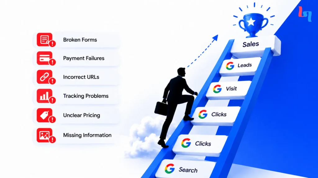
Start with what’s stopping customers from completing the purchase or enquiry.
Repair broken forms, payment failures, incorrect URLs, and tracking problems.
Once these are fixed consider content, pricing and pain points.
Run tests to see how well your changes have impacted your customers. A great example of this is Rakuten 24, an online retailer based in Japan.
In a case study published on Google’s web.dev, Rakuten 24 compared a performance-optimized landing page with its original version.
During the month-long experiment, the optimized version achieved:
33.13% higher conversion rate.
53.37% more revenue per visitor.
Rakuten divided traffic between two visually and functionally similar versions to assess the effect of performance improvements.
Those figures are specific to its experiment.
The useful lesson is that the company measured customer actions rather than assuming the changes had worked.
Judge improvements by business results
Suppose a shorter contact form increases enquiries by 30%, but most new submissions come from people outside your target audience.
Would you call that a success?
Not without checking the cost and quality of those leads.
The same applies when discounts increase online orders but reduce profit.
Measure qualified opportunities, completed purchases, acquisition costs, and contribution margins alongside conversion rates.
Banter Marketo’s published SEO case study documents organic traffic growth from 546 to 5,078 between March 2021 and September 2023. Even strong traffic growth needs to be evaluated separately from enquiries and revenue.
Before You Increase Your Ad Budget, Check What Happens After the Click
Remember the business that spent ₹60,000 and received only 18 enquiries?
Its hypothetical funnel showed that 120 visitors started the form.
Before spending more on advertising, I’d investigate why only 18 completed it.
The issue could be technical, related to the form’s complexity, or simply a matter of visitors changing their minds. The data tells us where to look, not what conclusion to assume.
If you’re unsure where your website is losing visitors, explore Banter Marketo’s digital marketing services and review the customer journey before increasing your advertising investment.
You paid to bring people to your website. Make sure they can complete what they came there to do.
Frequently Asked Questions
Why do my Google Ads get clicks but no conversions?
People may be clicking your ads without planning to buy. Sometimes, the problem is the website itself. Check what visitors search for, where they land, and why they leave.
Why are Facebook and Instagram ads bringing visitors but no sales?
Your ads might catch someone’s attention, but the product or price may not convince them. Check whether you’re reaching the right people and making purchases easy.
How do I know if my landing page is losing customers?
Look at how many people visit, start filling out forms, or attempt checkout. If they leave halfway through, find out what’s stopping them.
What is a good website conversion rate?
There’s no fixed number. It depends on what you sell and who you’re targeting. Focus on whether your website brings in genuine customers at a reasonable cost.
Can slow website loading affect Google Ads performance?
Yes. If your page takes too long to open, visitors may leave before seeing your offer.
Should I increase my advertising budget if clicks aren’t converting?
Not yet. First, check why visitors aren’t taking action. More traffic won’t fix a broken form or confusing website.